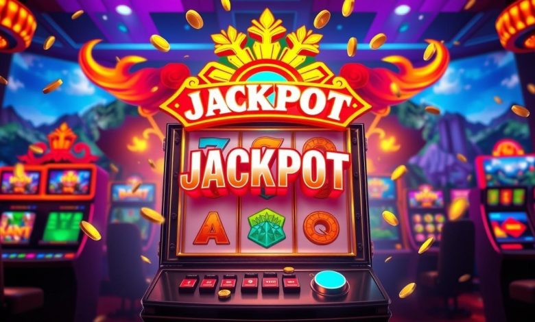
A well-designed online slot game communicates its personality before the first reel begins moving. Colors establish atmosphere, typography directs attention, and carefully positioned controls make navigation feel natural. Together, these elements shape how users experience digital entertainment.
The relationship between color psychology and online slot design goes beyond decorative appeal. Developers must consider contrast, accessibility, visual hierarchy, and screen proportions to create interfaces that remain readable and comfortable.
Although attractive environments can sustain attention, designing for comfort should never mean encouraging excessive gambling. Responsible interfaces balance enjoyable presentation with clear financial information, accessible stopping controls, and opportunities to take breaks.
Understanding Color Psychology in Online SlotsHow Colors Influence Visual Perception
Colors can influence attention, mood, and the way users interpret an interface. Warm tones often create energetic atmospheres, while cooler palettes may feel calmer. However, individual responses vary with personal preferences, cultural associations, and surrounding visual elements.
Why Color Consistency Matters
A consistent palette gives a game recognizable artistic identity. When buttons, symbols, backgrounds, and menus follow coordinated color rules, users can understand visual relationships more easily. Random combinations may appear lively but can make important information difficult to distinguish.
The Role of Warm Colors in Game DesignRed and Orange for Visual Emphasis
Red and orange attract attention because they often contrast strongly with darker backgrounds. Designers may use them for highlighted symbols or important notifications. Excessive use, however, can create visual intensity that becomes uncomfortable during prolonged screen exposure.
Gold and Yellow for Decorative Identity
Gold and yellow frequently appear in fantasy and casino-inspired artwork. Metallic textures can suggest grandeur, while bright yellow offers strong visibility against appropriate backgrounds. These colors should not be interpreted as indicators of higher winning probabilities.
Cool Colors and Comfortable Visual EnvironmentsBlue for Interface Clarity
Blue is commonly associated with calmness and technological environments. When paired with readable typography and suitable contrast, it can support organized interface design. Nevertheless, blue backgrounds alone cannot guarantee reduced fatigue or improved emotional comfort.
Purple and Green in Creative Themes
Purple often appears in magical or futuristic environments, while green complements nature-inspired settings. Their effectiveness depends on saturation, brightness, and surrounding artwork. Designers should consider accessibility because some users have difficulty distinguishing particular color combinations.
Understanding Visual Hierarchy and LayoutWhat Is Visual Hierarchy?
Visual hierarchy describes how interface elements are organized according to their importance. Larger typography, contrasting colors, and deliberate spacing help direct attention. In online slot gacor, essential information such as wager amounts and account balances should remain easy to locate.
Balancing Reels and Decorative Elements
The reel area usually occupies a prominent position because it displays the main game events. Background characters and environmental effects should support the theme without covering symbols. Effective composition separates decorative storytelling from functional gameplay information.
Using Negative Space Effectively
Negative space refers to areas intentionally left free from competing visual elements. Adequate spacing makes menus easier to understand and reduces crowding. A visually impressive design does not require every available area to contain animation or decoration.
Typography and Reading ComfortChoosing Readable Fonts
Decorative fonts can reinforce a game’s fictional setting, but they may become difficult to read at smaller sizes. Designers should prioritize clarity for instructions, balances, and menu labels while reserving elaborate lettering for nonessential titles.
Maintaining Appropriate Text Contrast
Text requires sufficient contrast against its background to remain legible. Light lettering on dark surfaces can work effectively when brightness is balanced. Poor contrast forces users to work harder to identify information, particularly on compact smartphone screens.
Keeping Important Numbers Visible
Wager values, payout amounts, and account balances require consistent formatting. Animated celebrations should never obscure these figures. Transparent numerical displays help users distinguish actual financial results from decorative visual effects.
Layout Design for Mobile and Desktop ScreensWhy Responsive Design Matters
Responsive slot interface design adapts visual elements to different display dimensions. A layout that looks balanced on a desktop monitor may become crowded on a smartphone. Developers must reposition controls and adjust spacing without removing essential information.
Portrait Versus Landscape Orientation
Portrait layouts can support familiar smartphone handling and vertical navigation. Landscape orientation provides additional horizontal room for wide reel structures. Neither arrangement is universally superior; successful design depends on the game’s content and intended device experience.
Touchscreen Button Placement
Mobile controls should provide sufficient space for accurate interaction. Buttons positioned too closely together can increase accidental selections. Clear feedback is particularly important when an interaction involves changing wager settings or confirming financial activity.
Micro-Animations and Visual ComfortHow Subtle Animations Improve Feedback
Micro-animations are brief movements that communicate interface changes. A button may highlight when selected, or a menu may transition smoothly between states. These effects can improve clarity when their purpose is understandable.
Why Excessive Motion Creates Problems
Constant flashing, rapidly moving particles, and prolonged transitions may cause discomfort or distraction. Developers should use animation selectively and provide reduced-motion options where practical. Visual sophistication should not interfere with essential controls.
Maintaining Smooth Performance
Complex graphics require appropriate processing resources. Poorly optimized animation can produce stuttering or delayed responses, particularly on older devices. Efficient rendering supports usability across a wider range of compatible hardware.
Designing for Extended Viewing ComfortManaging Brightness and Contrast
Excessively bright interfaces can feel uncomfortable in dim environments. Adjustable device brightness and balanced game artwork help accommodate different viewing conditions. Individual comfort varies, so flexible settings are preferable to one fixed presentation.
Reducing Visual Clutter
Crowded interfaces demand additional attention to identify important controls. Simplified navigation, organized information panels, and restrained decorations can make interaction easier. Clear design benefits both inexperienced and familiar users.
Why Breaks Remain Essential
No combination of colors or layout techniques makes continuous gambling risk-free. Regular breaks, predetermined session limits, and accessible stopping controls remain important. Visual comfort should support healthy interaction rather than encourage uninterrupted wagering.
Responsible Use of Color and Visual EffectsAvoiding Misleading Winning Celebrations
Bright colors and dramatic animations may accompany payouts that are smaller than the original wager. Responsible design should display actual monetary results clearly instead of relying on celebratory presentation to imply financial success.
Keeping Spending Controls Accessible
Deposit limits, session reminders, and account information should remain easy to find. Important protective functions should not be hidden behind decorative menus or unnecessary navigation steps.
Frequently Asked Questions About Slot Design PsychologyWhy Is Color Psychology Important in Online Slots?
Color helps establish atmosphere, direct attention, and support recognizable interface elements.
Which Colors Are Best for Comfortable Slot Interfaces?
No single palette is universally best. Appropriate contrast, balanced brightness, and accessibility matter more than specific colors.
Does Interface Layout Affect Winning Chances?
No. Layout design does not inherently change RTP or random outcome probabilities.
Why Is Negative Space Important?
It reduces visual crowding and helps users identify important information.
Can Better Graphics Reduce Eye Strain?
Clear typography and balanced visual effects may improve comfort, but breaks remain important.
What Makes Slot Interface Design Responsible?
Readable financial information, accessible protective controls, appropriate contrast, and nonmisleading animations are essential qualities.